Thursday, July 10th, 2008 - 10:33am
A Fresh Start
It is time to get a fresh start. The old design wasn’t inspiring me, and frankly it was a bit of a pain to administer. Like many bloggers, I cobbled it together with some duct tape and glue, hoping it would stand the test of time and serve as an outlet for my need to write. It has served me well for the past 4 years, but when it comes right down to it, it was time to put the old design to rest and find something to be excited about again.
There were pieces of the site that I just hated using or working with. Why? Because I was doing things manually, and anytime you do something manually, it becomes tedious and a pain to do. What next? You just end up not doing those tedious things. Like posting. Keeping track of the events that I’m speaking at. Add to that the additional work of managing and responding to comments and that lead to inactivity.
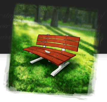
So, with that, we unveil this new version — a new design with new functionality via some WordPress plugins. Jeff Smith, (the perfect hybrid designer/developer) who works with us over at Further Ahead created something that I just love — a beautiful design that inspires me to fill the screen with worthy writing. He also did the coding and WordPress integration, and some custom WP plugins (and mods to existing plugins) to help manage the speaking/training events listed over in the sidebar and the tumblelog that pulls in content from the pieces of me scattered across the internets. All in record time so that we could go live. The wonderful illustrated bench graphic was commissioned from the brilliant artist Anton Peck. Huge thanks both of them for such a wonderful job on this project!
The first version of the blog is archived for historical purposes, and with the magic of some rewrite rules (we hope) we haven’t broken any incoming links. I’m sure there are a few things that still need some tending to, but for the most part, here it is. Welcome!
Erik
July 10, 2008
Well, well, well! A fresh start, indeed.
Love the new look and the illustration by the talented Anton (doesn’t that sound like a magic act?) is perfect.
Keith
July 10, 2008
The site looks great. Congrats on the re-launch!
Matt Robin
July 10, 2008
Great effort Derek! I especially like the park bench illustration, the feather, the clean layout, and the use of colours – all good. As much as I liked the look of your blog before, this is certainly an update that has brought it back to life.
Jonathan Snook
July 10, 2008
I think it’s a classy design, a nice play off the “feather” nickname, and look forward to some more great writing from my fellow Ottawan. Kudos!
(my only complaint, atm, is that the tabindex from this comment box seems to be the search box waaaay up at the top of the page…I loves me some tabindex. (this is in Opera 9.5.1/Win, btw)
Andy Clarke
July 10, 2008
Oh now that IS nice.
feather
July 10, 2008
Jonathan – oops. One of the biggest things I dislike is the tabindex on the default install of WordPress. I’ve removed all of the tabindex so the next tabstop from this comment box will be the submit button :)
Anton
July 10, 2008
Awesome – it’s live! I think Jeff did a fabulous job integrating my illustration. Thanks to both of you! Derek: once again, it has been an absolute pleasure working with you.
So – who’s next? Line forms at my email address (anton [at] antonpeck [dot] com) right… now.
goodwitch
July 10, 2008
(reaching in to the box of chocolates lookin’ for something extra yummy) My, what a delicious design.
That Anton is a gifted illustrator..and Jeff Smith is a gem.
Yep, this site, really hits the spot. Kudos!
Ben Buchanan
July 10, 2008
Nice work man, it looks great! :)
Matthew Pennell
July 11, 2008
Congratulations on the re-launch, Derek/Jeff/Anton – great work as usual.
I know exactly how you feel in respect of the lack of inspiration. I don’t think I’ve written anything of any import for months – but launching a new blog, even using Kubrick, got me going again.
Must. Redesign. Site. Anton?!
TuringTest
July 11, 2008
Refreshing, that feather on a bench on a park. But why oh why the grey text on white background? I never understood that 2.0 fashion, it impairs readability by reducing contrast and blurring the letters.
I’ve looked for the rationale for that trend, but I haven’t found any. I assume it’s done because it “looks fancy”, but it doesn’t for me.
Fortunately I can configure my browser to get rid of the website colors, and I apply it to all blogs that suffer from this problem, but it ain’t funny.
Jeff Smith
July 11, 2008
Just wanted to pop in and say thanks to everyone for the great comments. Another thanks to Derek for the compliments in the post.
@TuringTest: we’ve made some changes to the text colors of the site to improve contrast. Hopefully it will help you out a bit. As Derek mentioned, there are things that still need tending to around here and we’ll fix those issues as we run across them.
bruce
July 11, 2008
Looks groovy, Derek.
Can we see the plugins you use for your future events sidebar? I’ve been using event calendar from firetree, but it’s quite cumbersome and doesn’t offer much stylistic possilities.
Jonathan Hollin
July 11, 2008
Wow this is really nice. A beautiful design – well worth a four year wait. Congrats all round.
patrick h. lauke
July 11, 2008
about time too :)
Ethan
July 11, 2008
Killer stuff, guys. Derek, congratulations on the new design!
Stephen
July 11, 2008
Great new design. Can you tell me about the events sidebar..is this being run by a plugin? If so, can you provide a little more info.
Thanks.
Blair Millen
July 11, 2008
Lovely fresh design Derek, I like it a lot!
Carl Camera
July 12, 2008
Looks great, Derek. Very clean and refreshing indeed.
Rob Cottingham
July 13, 2008
Smashing, Derek. Congrats to all involved!
Gary Barber
July 13, 2008
A restart is always good, it recharges the batteries and gives every thing that “new feel”.. well at least for a while.
Ruth Ellison
July 21, 2008
The new design is looking nice Derek.
feather
July 27, 2008
Thanks all, for the kind words! Much appreciated :)